Rockefeller Foundation: Digital Annual Report

Co-designer: Hannah Cusworth
Co-designer: Jodie Custodio
Creative Director: Kate Starr Evans
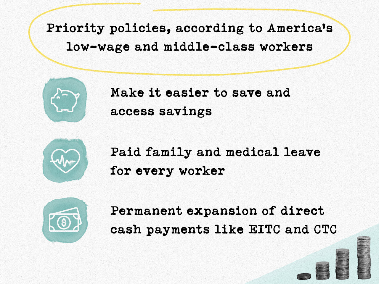
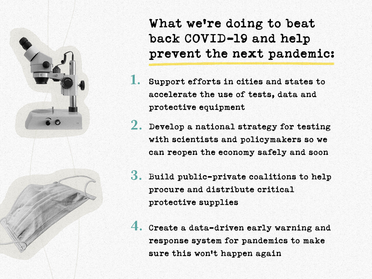
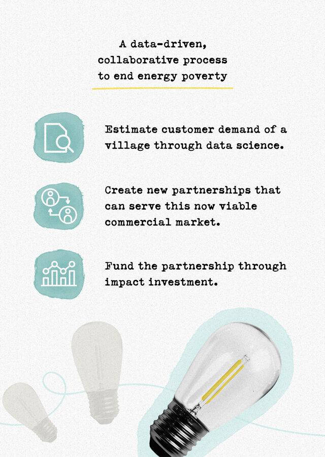
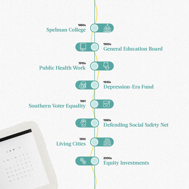
The challenge: Visually illustrate the focus and direction of Rockefeller Foundation’s organization under Dr. Shah’s leadership in their Digital Annual Report. When translating a dense amount of quantitative and qualitative analytics, it was important that the visuals felt clean and approachable, yet reputable. Collaborating with my fellow colleague and co-designer Jodie Custodio on this project, we wanted to ensure that the designs supported the tone of Rockefeller Foundation’s vision for the organization. The goal for the visuals was to feel both personal and trustworthy.
The process: The following keywords guided my inspiration when curating style references for the graphics and illustration approach of the annual report.
Informative
Sophisticated
Hopeful
Cutting-edge
Vibrant
Dynamic
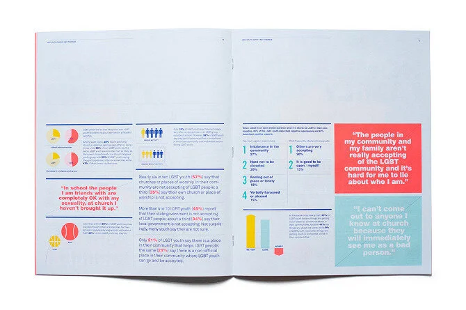
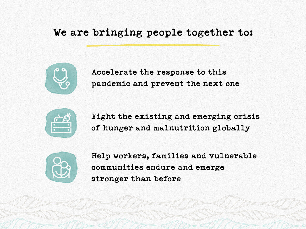
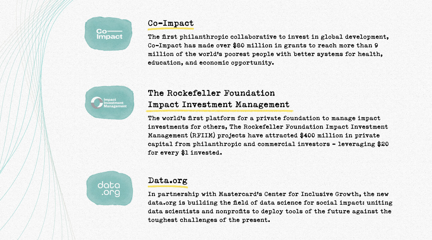
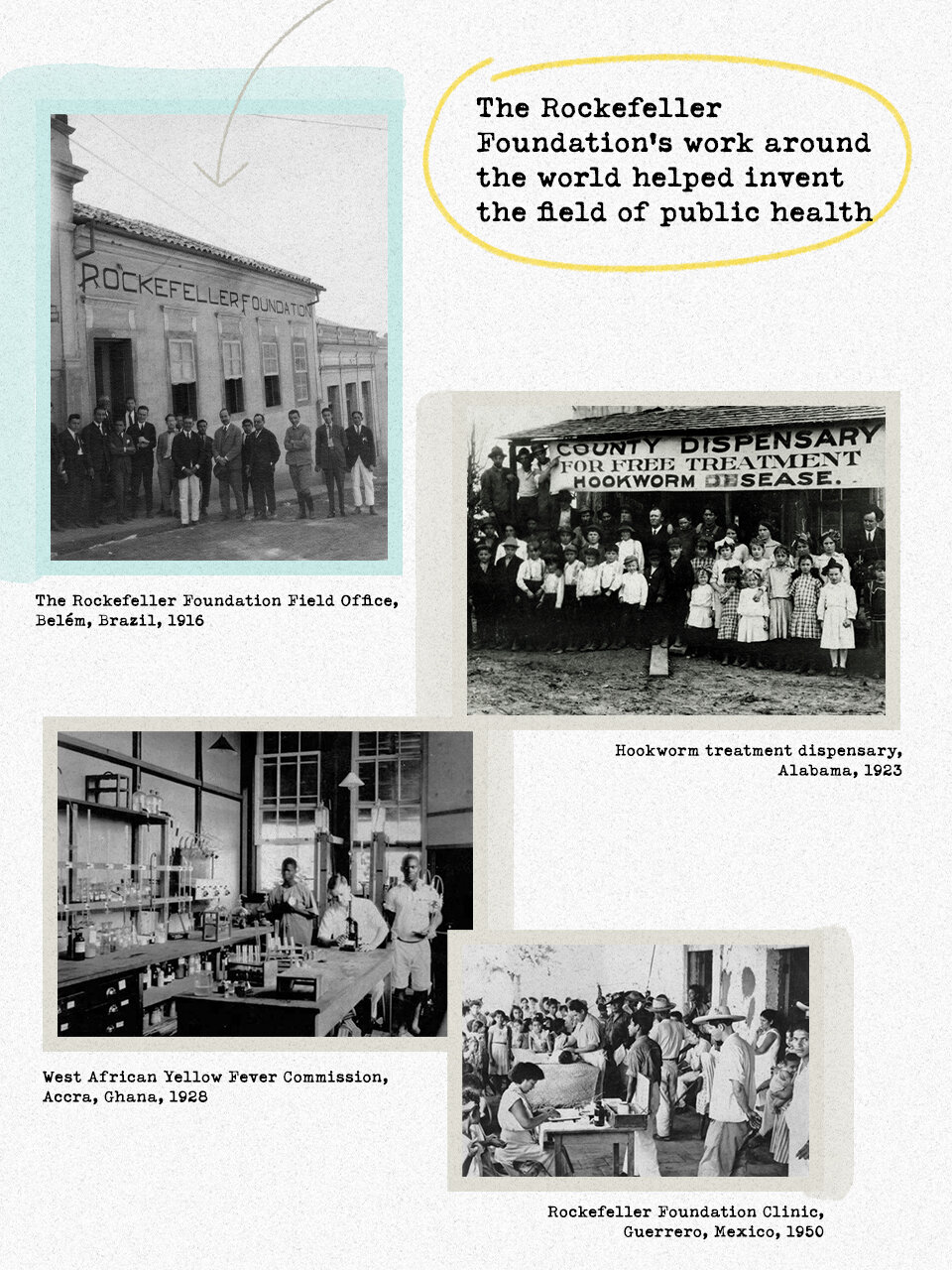
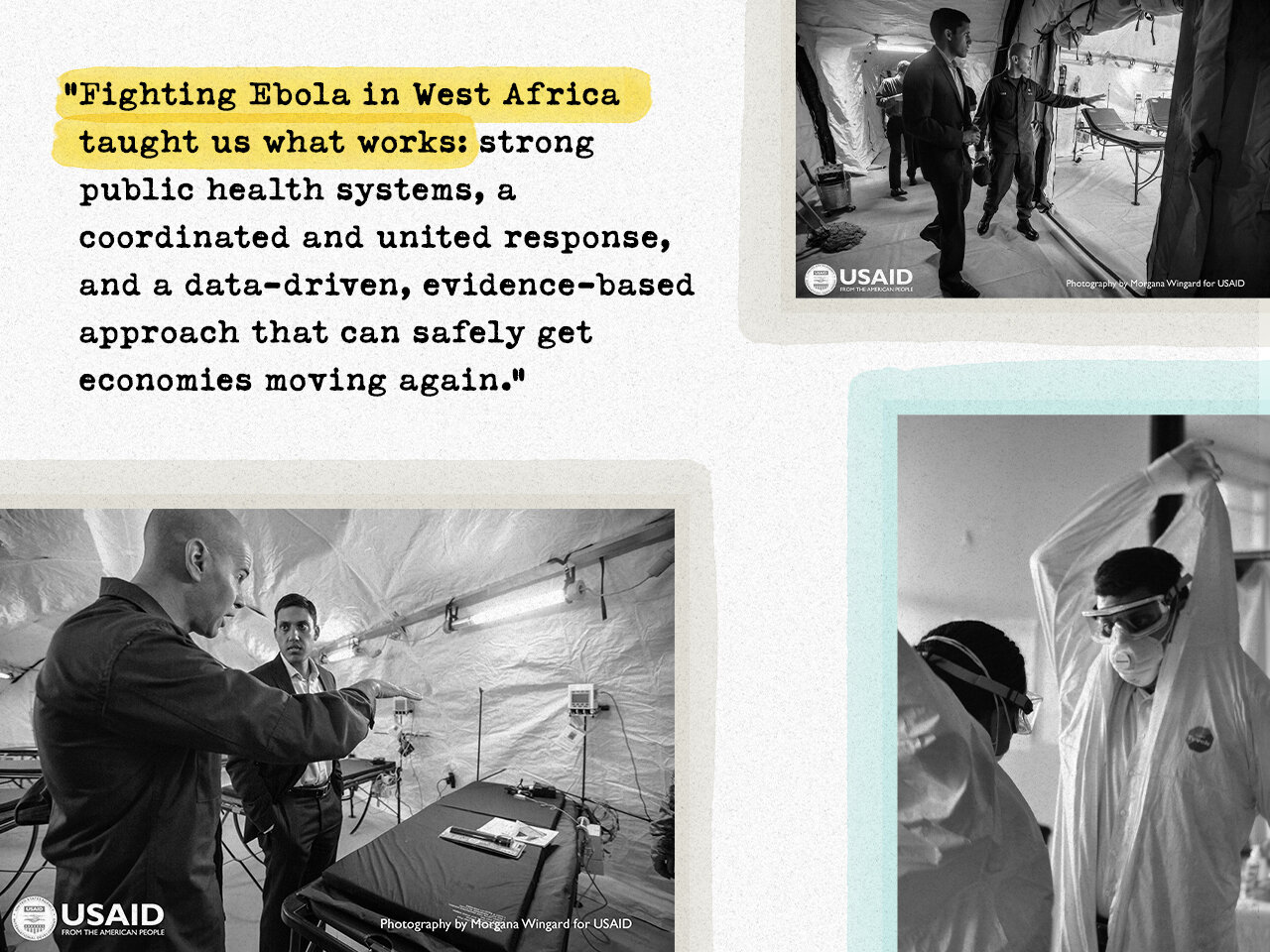
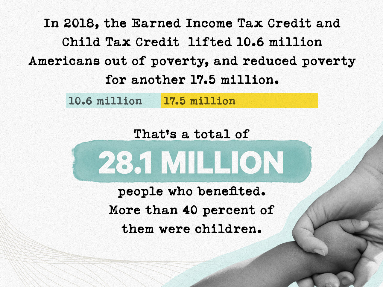
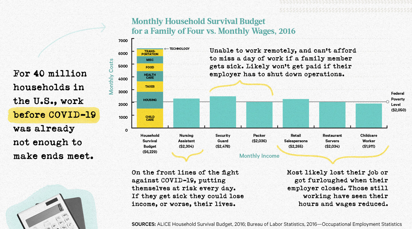
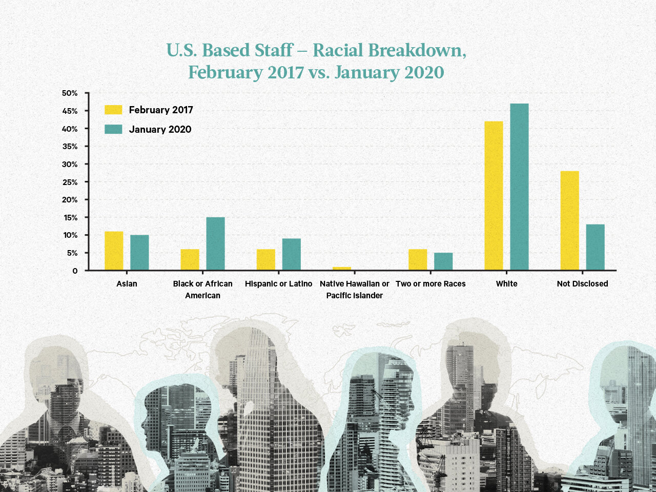
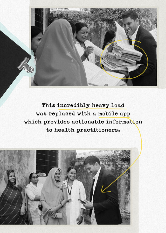
The solution: To mimic the paper texture and highlighted markings of a physical report, we implemented a combination of their soft beige and pops of Rockefeller Foundation’s primary teal and secondary yellow in order to emphasize key moments of content. Jodie and I also recommended that we couple delicate grid-like line-work with hand-drawn elements and photo clippings in order to visually connect the hard data to the real community change the Foundation has fostered across the world. We took inspiration from the examples below that show treatment of data visualization in ways that are visually vibrant while maintaining a sophisticated expression in displaying content.

